During Saturday’s Sector Conference, I revealed the new logo design selected by the Executive Council to be our official logo going forward.
The new logo is forward-looking while paying tribute to our proud history. Several features of the new image are adapted from logos the Guild used decades ago.
Take the eye. The original American Newspaper Guild logo incorporated an eye that stuck around for several decades. We brought it back.
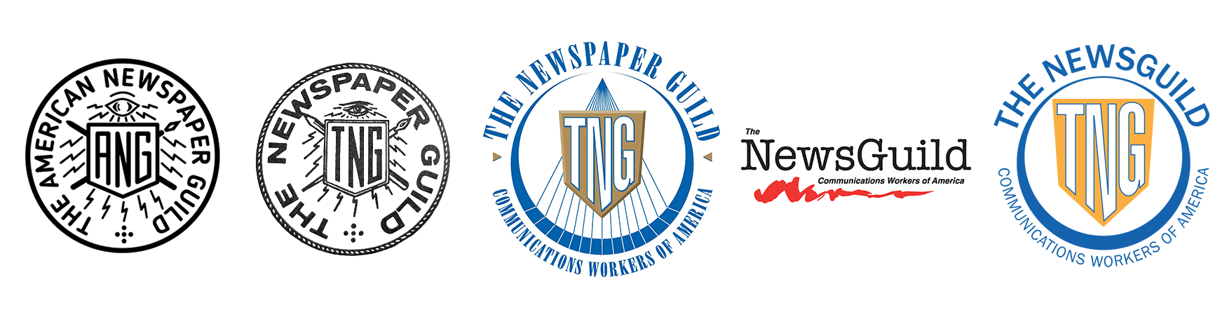
The eye never blinks, symbolizing the watchdog role journalists play in watching over our democracies and holding power to account.
The shield at our center has always been present in our logos (except for a brief hiatus a few years ago). It symbolizes the protecting quality and power of workers united in a struggle together. We are stronger and more protected together.
The shield’s vibrant red nods to the color of our parent union, the Communications Workers of America. It’s a reminder of the sacrifices — and blood spilled — of workers who came before us.
The lines radiating from the shield represent the power truth plays in our society and the role of media in shining a light in the darkest corners of our world. Our workers are the light in the darkness.
The new logo was commissioned by the NewsGuild and designed by NewsGuild member Akiko Spencer, a graphic designer at the Chicago Sun-Times. Before being hired to design the new logo, Akiko has advocated for the Guild and supported the Save The News campaign along with designing other logos, such as the Austin NewsGuild unit logo. It has bats!
I want to thank Akiko for a great design that unites our union and looks to the future while also remembering our past.
We’ll soon be in touch with updated pins and T-shirts (and yes, bomber jackets) with the new branding.